Industry
Furniture
Client
Gardner White
Rebranding Gardner White Clearance Center

A collaboration with Gardner White on rethinking their Clearance Center
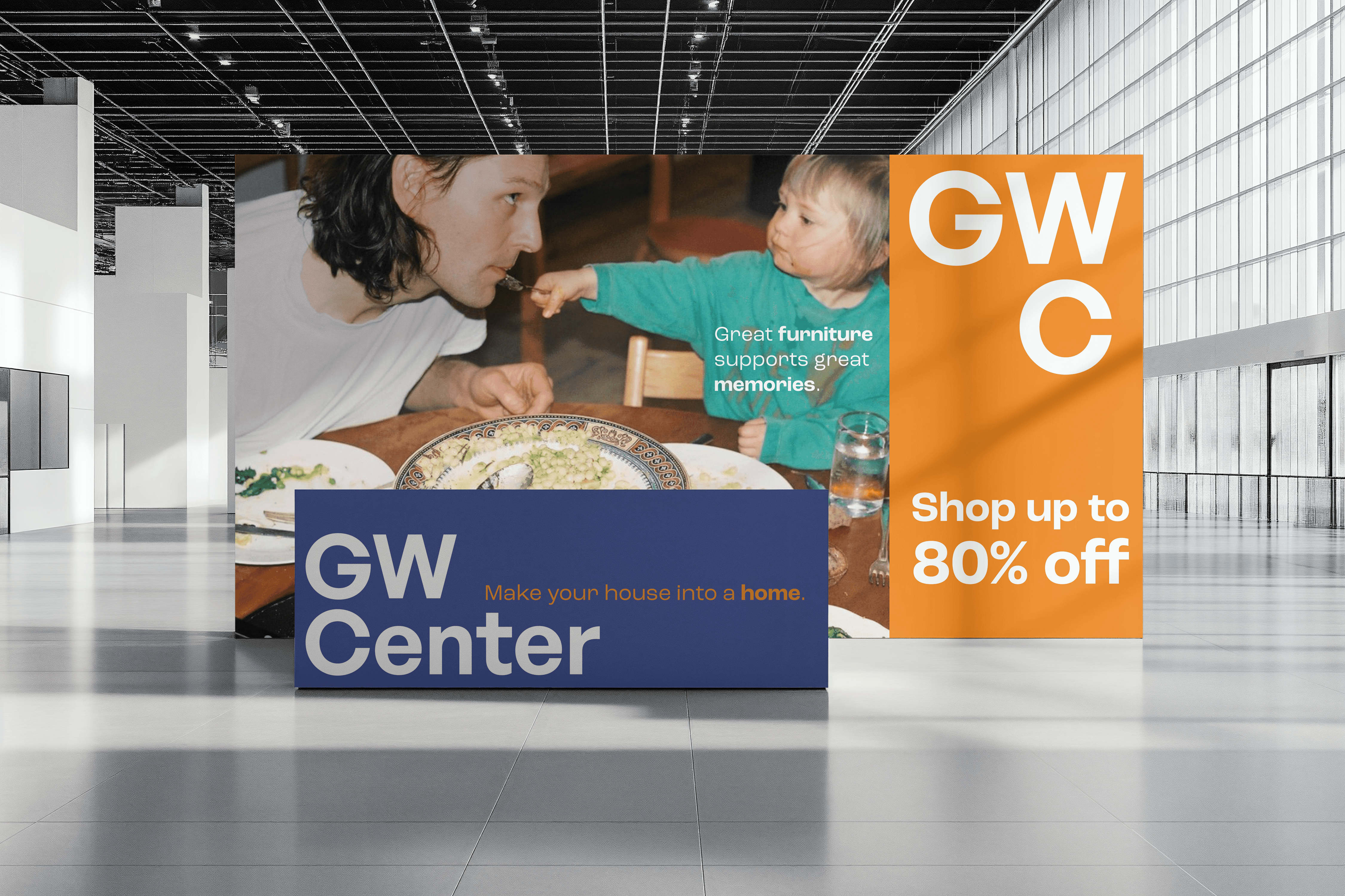
We wanted to frame the Clearance Center in a more friendly light. As a place that offered affordable, desirable pieces, not just leftovers and overstock. We went for a fresh, flexible look for the rebrand that can adapt to represent how life, and taste changes constantly. We renamed the Clearance Center to GW Center to show our dedication to the customers. They are the center of the business just as much as furniture is the center of the home. We wanted to connect with our roots by selecting colors that come from different parts of Michigan since Gardner White as a whole is a Michigan born and raised brand. Our typography is friendly, and inviting, encouraging people to shop at the GW Center. Finally, our copywriting feels friendly, bringing some humor to make the GW Center feel more approachable.